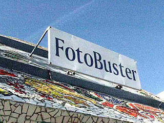
In a small run down shopping center in Altadena CA (that's immediately to the north of Pasadena) there is a familiar bit of American architecture - the drive-through kiosk. This one had been a photo developing business named FotoBuster- now out of business. Another vicitim of digital photography. I've driven by this spot dozens of times.
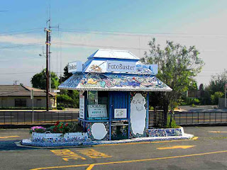
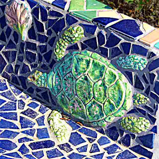
What I never noticed about the FotoBuster kiosk until Friday was the strange and wonderful mosaic decorations of the building. Random odd shapes and bright colors are interrupted by the occasional ceramic face or turtle. Some artist must have spent a long time tiling this little building. I found one online reference to it, this post at the blog L.A. Snapshot.

If you're not interested in the kiosk or mosaics it is highly recommended that you try the frozen goodies at Bulgarini Gelato, nestled in a corner of this same shopping center. It's near the corner of Lake and Altadena avenues.
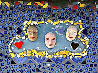
I wonder if there's a word to describe this individualist style of decoration. On Wikipedia the Watts Towers is called "vernacular architecture" - but in this case the actual building is entirely normal, only the tiles are unique. I have no clue who did this or why or what the residents of the area think of it or whether the local preservation groups think it worth preservating.
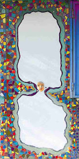
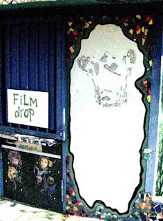
I'm pretty sure the thing that looks like a cow's head is just residue of the glue from a former sign. Below the picture of the turtle sculpture is a long composite panorama of the north curb of the kiosk. You can see the turtle at the right end. The panorama picture is 10 times wider than it is high. Click any picture for an enlargement.

Tile Tags: FotoBuster. . . kiosk. . . mosaic. . . vernacular architecture. . . Altadena. . . Bulgarini gelato
5 comments :
I wonder what keeps it standing. Is it being thoughtfully preserved by someone or some group?
Ironically, the original application icon for Photoshop was that of a "fotomat." 1990, the beginning of the end for most film processing.
http://www.storyphoto.com/multimedia/photoshop_graphics/Knoll_org_icons.jpg
It's still standing because it hasn't fallen down. The area is not exactly bustling with commercial development.
Leslie and I belong to the Pasadena preservation group - who are much more interested in important buildings from long ago than in quirky tiled kiosks probably less than 20 years old.
And besides it's in Altadena. Maybe they have their own preservation group.
Thanks for posting this. I drive by once in a while, but didn't notice it. "Vernacular architecture" is not the correct term for this type of thing; the Wikipedia articles should be edited to correct the misuse in relation to Watts Towers. Vernacular architecture specifically refers to styles of building, usually responding to local conditions, that developed outside of the mainstream of formal architecture. The use of decorative or sculptural art is not one of the elements intrinsic to vernacular architecture, in fact vernacular architecture is more often simple and unadorned. I am frustrated that I can't think of the correct term, if there is one, for eccentric buildings that are primarily distinguishable as works of folk art, and a quick google search didn't help. It is such a significant and distinct form of folk art, that it should have it's own name. I guess it would be accurate to call it monumental folk art architecture, but that is an awkward phrase. In addition to Watt's tower I can think of a couple other similar sites. There is Grandma Prisbrey's bottle village in Simi Valley, Howard Finster's Paradise Gardens in Florida, and another collection of buildings sculptured from (as I remember) coral in Florida. There a great local "art house" and yard at 1422 Sierra Bonita north of Washington.
Thanks Jim, welcome to Mixed Meters.
Thanks to you I know what NOT to call it, but not WHAT to call it.
Still, I'm more interested in how it got there - i.e. who decorated it and why. And a little bit interested in what the surrounding community thinks about it.
So far the only comments have been of the "I drive by there but never noticed." genre.
After a little more research, it appears that the kiosk may fit best into the category of "novelty architecture." It might also be called a "folly," though that term seems to be reserved for buildings built solely for a decorative. purpose. Both terms are described on Wikipedia. Or maybe it is an example of functional architecture converted into a folly.
I'd also like to know the story of the thing.
Post a Comment